Detailed visual description
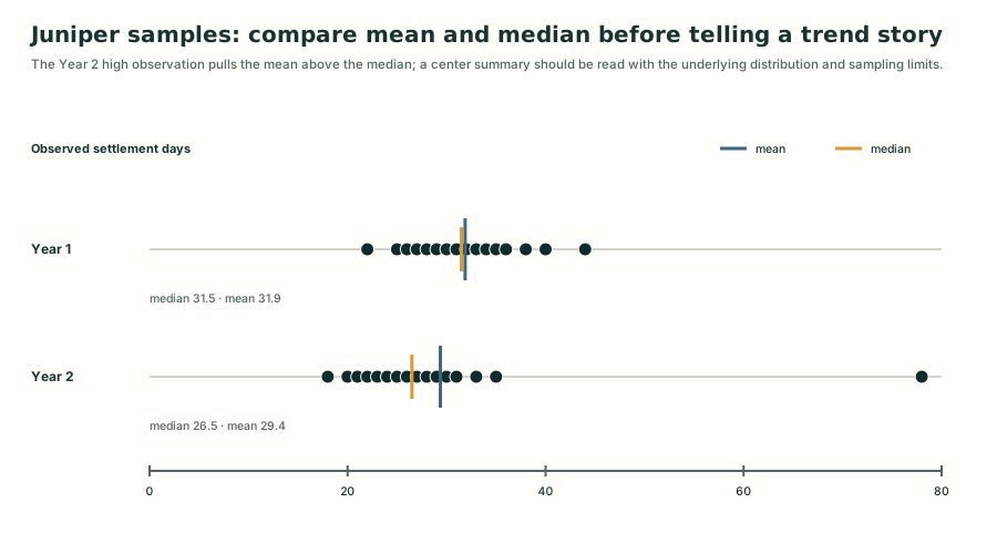
The chart reads the sixteen settlement-day observations in each checked fictional sample and plots every observation on a common zero-to-eighty-day axis. Year 1 values occupy a compact range from 22 to 44 days, with median 31.5 and mean 31.9. Year 2 values mostly range from 18 to 35 days but include a separated 78-day observation; its median is 26.5 and mean is 29.4. The display does not establish a population trend or causal explanation.
Review apparatus
Visual provenance and review
- Technique
- data bound svg
- Role
- explanatory
- Review state
- revised
- Rights
- CC0-1.0 · Generated from fictional project data
Review notes
- The first renderer showed only four mean/median bars even though the teaching claim concerned distributional shape.
- A real OpenAI developmental review correctly classified that mismatch as major.
- The revised data adapter exposes all thirty-two observations on a shared scale and overlays checked mean and median markers.